 Sometimes decor inspiration can come from the most unexpected places. I grew up on old movies, and I still get such a nostalgic pleasure from watching my favorite Cary Grant and Audrey Hepburn films over and over again. I was re-watching the move Indiscreet when I noticed that the gallery walls in Ingrid Bergman’s London apartment featured black and white prints with colorful matting surrounding the prints—I loved it! I decided that it would be the perfect inspiration to finish the gallery wall in my art room. Bring on the color!
 Supplies:
-colored cardstock or mat board
-X-Acto knife
-metal ruler
-cutting mat
-various black and white prints & corresponding frames (make sure the frames are several inches bigger than the print so you’ll have a good amount of colored mat per frame)
You can use colored mat board to mat your prints, but I find that it’s easier (and much more cost effective) to work with colored cardstock instead. So, the first thing you’ll want to do is pick out several colors of cardstock in sizes that are at least as big as the frame that color will go into.
 Remove the backing on your frame, and use the backing as a guide to trace the outside edge onto your colored cardstock (place it on a corner so two of the edges are already cut for you).
 Once you cut the outside edge with your ruler and X-Acto knife, you’ll need to measure the window that you want your print to show through, and center those measurements in the middle of your cardstock. For example, if your print is 8″ x 10″ and your frame is 12″ x 16″, that means you want your mat to be 2″ wide on either side and 3″ wide on top and bottom. Mark those measurements on the inside of your cardstock, and cut out the middle opening of the mat.
 Use masking tape (or an acid-free tape option) to center and secure your print to the back of the cardstock, and you are ready to put your print back in its frame.
 As always, the best way to map out a gallery wall arrangement is to use paper placeholders that are the exact size as your frames, and move them around until you find a grouping you like.
 Once arranged, simply measure on the real frame how far the nail needs to hang from the top of the frame, and place a nail the same distance from the top on the corresponding paper placeholder. Once the nail is in place, simply pull the paper off the wall, and your hanging placement will be just right!


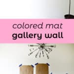
 Prints clockwise from top: 1 (printed at home), 2, 3 (printed at home), 4, 5, 6, 7.
I made a few of the prints myself to make the gallery wall more affordable and add a personal touch to the wall (we simply adore Steve Martin’s The Jerk, so I wanted to add a quote from that movie). I love the pop of color that the gallery wall adds to the space, plus, if I ever change my color scheme I can always redo the mats for a quick update. What are you waiting for? Get color happy in your home! xo. Laura
Credits // Author and Photography: Laura Gummerman (& Todd Gummerman!). Photos edited with Stella and Frankie of the Signature Collection.
Bright colours rock and with bold black and white prints this works super well! 🙂 Might just have to do a few of these for our pad!
so cute! I just made a gallery wall as well! Here it is ! http://coffeechalk.wordpress.com/
This is so AMAZING.
I’m doing it right now I just love the colours.
Beautiful post !
Agreed. This is such a good use of bright colours. I assume this would only work on a plain wall.
I’ve just discovered your blog and I’m hooked! I’ve been planning my own gallery wall and this is such a cute way of adding lots of colour really easily and cheaply! Check out my post about my wall and if anyone can add any more suggestions I’d be so happy!
http://thriftylegs.wordpress.com/2014/07/22/gallery-wall-wishes/
I love the decor of these homes. They have a clean, minimalist look. It is important to choose the objects with varied design and fun colors. I recommend this site selling objects of design erent.com
I love the “The Jerk” reference. Makes me so incredibly happy.
I love how much these pop!
SATC movie quotes as well If you didn’t know it 🙂
Nice set of colors.
Love this pop of color.. (and your cat is too cute!!)!
Love how bold this turned out! What a fun look for an art room!
I love the colored mats and the fun prints you used. I am so inspired by so many things in this post!
I like it! It’s so easy and beautiful. I will definitely try this.
http://chicmunchie.blogspot.com
love the colours – i decided to paint my wall rather than bright pics!
house post – http://www.bloglovin.com/frame?post=2578467839&group=0&frame_type=a&blog=11875549&frame=1&click=0&user=0
AHHH!! So pretty!! I love this idea, what a cool way to add color to a room. I love that color outside the lines print. Awesome.
What a great way to introduce color on a wall! The bright matts highlight the prints and make the wall a happy place!
blog.this-makes-me-happy.com
I love that this adds so much color. I am so into bright colors right now and this is the perfect way to make any picture or sign look colorful.
This is so good!
Oooh the kitty on the last picture looks EXACTLY like my kitten Kiwi that was run over by a car. Really spot on image, except my little guy had a white tip at the end of his tale!