 It’s been a while since I shared any updates from around my home with you guys. Lately I feel like I have been on a roll! I’ve been making lots of progress in SOME of the rooms in my house, but most of them still don’t feel “done” to me. If that’s even a thing. 🙂 But, just wanted to share some progress with you all in our living room.
 So I call this our “TV living room” because we have two spaces in our house that function like a living room. One part of our house is a big open-style space that has our kitchen, dining room, my office, and a living room in it. But then there’s this other space that we decided to turn into the “TV living room” because it’s a fairly dark space (like a movie theatre), and it’s separate from the other spaces. So someone could be watching a show but not really be disturbed if someone else is in their home office sewing a late night quilt or something… not that this happens at our house often. Oh wait, yes it does. Ha!
If you think the layout sounds confusing, check out my empty house tour video, as it helps to really show the spaces better than I can explain in text.
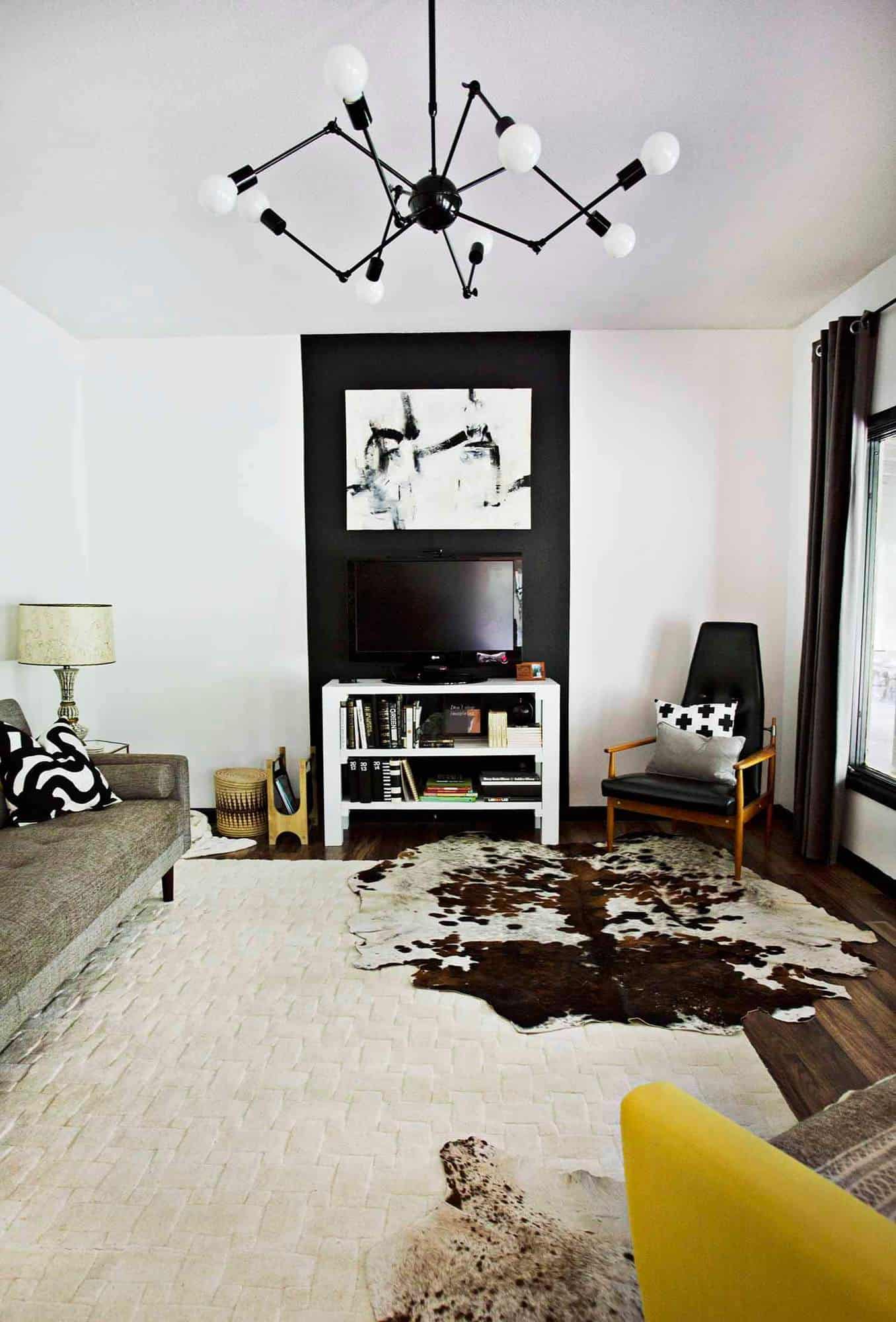
When we bought the house, this room was already really great. All we did was paint the walls white and move in. Eventually I swapped out the light fixture, which was the first big thing that made this room feel more like us. (Also it feels like Beetlejuice to me too – sort of a spider up there!)

 The second thing is I pretty recently painted this big black stripe on the wall behind the TV. This serves a couple purposes. First, it helps to hide the TV when it’s not turned on. I don’t really have a big desire to 100% hide my TV in my house because I don’t mind seeing them in spaces. But I don’t really love when they feel like the most prominent thing in the room. So I like how this helps to blend the TV into the wall, unless it’s turned on and we’re watching something.
But the second thing this black accent stripe does is it really showcases the artwork that we hung just above the TV. This is a painting my mother created for my last house, and I’m only too happy that it’s getting an even better spot in our new house. Yay!

 Above the couch I hung a series of photos that shows off an erupting geyser in Iceland. I took these photos while we were visiting there last year. I think Iceland is one of my favorite places I’ve ever visited. So I’ve ended up decorating our home with a number of photos from that trip!
Now I must admit, something about the couch area feels a bit off to me. Like maybe our couch is too small for the space? Or maybe I should move it off of the wall some, like maybe it’s too far back. I really like this couch as it folds out into a futon, and Trey and I honestly pull it out so we can snuggle and watches movies together at least a couple times a month – so I like the futon feature. But this part of the room really just doesn’t feel quite there to me – but it’s coming along for sure.
I think we for sure need a coffee table in front of the couch. I had a DIY idea, but I’m wondering if the room has too much DIY already? Hmm.
 I already shared the bookshelf on our back wall and also how I had this armchair reupholstered with a bright yellow fabric. I’ve been trying to protect it from dark jeans by adding throw blankets now and again. So far it’s holding up OK but probably not as well as the last fabric (although I like the yellow color, so whatever!). I also might take the seat cover off and either wash it or have it dry cleaned once a year just to keep it feeling bright and fresh.
You can see my home office in the background here too.
 We had the cowhide rugs in our last house, and they seem to hold up the best in our house compared to other rugs. Our dogs don’t have messes that often (they have a dog door), but when they do, I seem to have much better luck cleaning these cowhides than I usually do with other rugs. So we decided to layer those with an inexpensive basket weave style rug underneath to make this space feel more cozy.
That’s about it. This room still needs some work, but I’m a pretty slow decorator who also tends to change her mind fairly often. So I’m not really in a big hurry. 🙂 Thanks for letting me share! xo. Emma
Room Sources: TV stand/DIY, Light fixture/eBay, Couch/UO, Black chair/flea market, Yellow chair c/o Thrive Furniture, Basketweave rug and metal glass top side tables/Target, Cowhides/vintage + eBay, Tree stump side tables/DIY, Black and white lamp/vintage, Gold lamp c/o Joss & Main, Magazine holder/DIY, Curtains/IKEA, and Large black and white artwork is an original Elizabeth Chapman.
Credits // Author and Photography: Emma Chapman.
Room looks beautiful! Where did you snag those square white frames? I’ve been having a tough time finding good ones!
Placing such a photograph made me pay more attention to the picture but the TV was not very noticeable
It looks something different. I Like it.
I love love love the black, white, beige and yellow combination! Wow!
Love, Caroline
https://carolinespassion.wordpress.com
Love the black stripe! It gives the same feeling that a fireplace would but thousands cheaper. Good choice!
You look like a fashionista
And your room is excellent, just like you so
Love it
This is stunning, I love that lamp!
http://www.makeandmess.com/
For a simple solution I would hang the pictures above the sofa 2 over 2 in a clockwise sequence. This would make a vertical area that would match the one you have going on with the tv/painting pairing. I think you’re right about the sofa not being long enough for the length of the picture arrangement you have now. I would wait until you get a coffee table before rearranging the other pieces. I like the white frames with the photos, they don’t distract from the photos themselves like I think black frames would. Just my two cents worth. ? I really like what you have so far.
I love this style http://www.hannamarielei.com
Love the black stripe -and love your Mother’s painting even more! I also think pulling the furniture closer together will do the trick. I would try bringing the two chairs closer together to mirror the width of the couch -and then add a round coffee table between them (though the basket weave rug would then be too large for the furniture orientation)..? Moving the couch to face the TV could work but my couch and TV have the same relationship in my home because laying down is our preferred method of watching. Or! Or you could leave the couch where it is (if the room is wide enough adding a slim console behind it is clever) but bring the handsome black chair to join the yellow with it’s back to the outside of the room and then throw a non-view-disrupting daybed across from the couch.?! Coffee table for sure -oh, and ottomans!!! I also really liked the black frames suggestion to both bring more weight to those amazing photographs and to encourage more conversation between the pictures, the stripe and the lovely black window trim (which I also really, really like btw 🙂 Thanks for sharing!
I love the black stripe to “hide” the TV in plain sight. I, too, hate it when rooms are centered around the TV. This is the best of both worlds – the TV is still readily available, but not the main focus of the room. Really neat idea.
Yes! I came here to post just this!
When Emma said something just feels a little off, I felt the same way… I immediately thought the white frames on the white wall feel too weak. Changing the frames out for darker frames would be just the ticket. They would feel more substantial for sure and also balance the weight of that gorgeous black stripe.
I also agree with someone else who posted that the furniture is spaced too far apart for creating that cozy feeling I think Emma is trying to achieve.
I was thinking black frames would add more visual weight too the photos as well. The black stripe to mask the tv is a great idea!
Gasp! That is one gorgeous space! I fell in love with the chandelier in particular.
http://annescribblesanddoodles.blogspot.com
HEY THERE. My teenage years were spent in Springfield. Went to junior high and high school there. Graduated from Hillcrest High School!!! So love seeing your blog because it, honestly, never occurred to me that anything stylish was in Springfield and I couldn’t wait to get the heck outta there. That was in the 80’s though so I am sure it has changed A LOT!
Anyhooo…..where did you get that fantastic chair that is in the corner?
Vintage right?
Awesome transformation!
http://www.mytwopence.com/
The stripe to hide the TV is so smart! I love it and the geometric element it provides!
I agree with the poster above that said the frames above the couch add very little visual weight. I think black frames would bring more balance and in a sense be geometric squares to go with the long stripe. I love the texture of the weave look rug and the contrast of the cowhide.
Room looks beautiful! Where did you snag those square white frames? I’ve been having a tough time finding good ones!
Second all the comments regarding placement of the sofa. How can you possibly watch TV with your neck craned at such an angle? That just seems super uncomfortable.
I would add a large plant to the far corner of the room, to the left of the TV. I also agree that more visual weight above the sofa would help – maybe a dark wood or black photo ledge? Or colored mats in the frames? I worry black frames would be too much going on.